-
"A global network of avant-garde movements flourished during the first half of the twentieth century, connecting artist and designers across Europe and the United States. Written correspondence, presented on dramatically designed stationery, was a vital part of the infrastructure of this international community. Artist and designers translated concepts from painting, poetry, and architecture onto the commercial format of the letterhead, creating, in effect, ‘corporate identities’ for modernism. Stationery for Futurism, Dada, De Stijl, the Bauhaus, and other groups and institutions served as typographic manifestos for the avant-garde. Some of the works drew on the normative conventions of commercial stationery – often with a flash of irony – while others reflected new concepts of typographic rationality." - Ellen Lupton
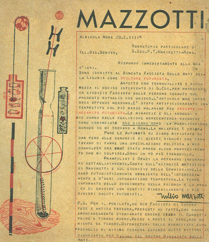
Bruno Munari, Mazzotti. Italy, 1934

FT Martinetti, drawing by Giacomo Ball, Movimento Futurista. Rome, 1939
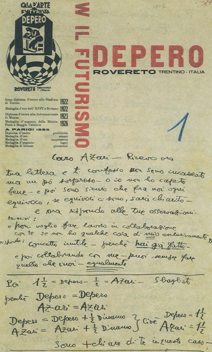
Fortunato Depero, Depero. Italy (Trentino), c. 1927 (Collection Getty Center for the History of Art and the Humanities, Santa Monica)
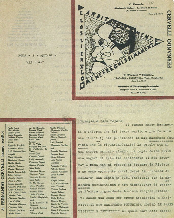
Anonymous, Fernando Cervelli. Rome, 1932 (Collection Getty Center for the History of Arts and the Humanities, Santa Monica)
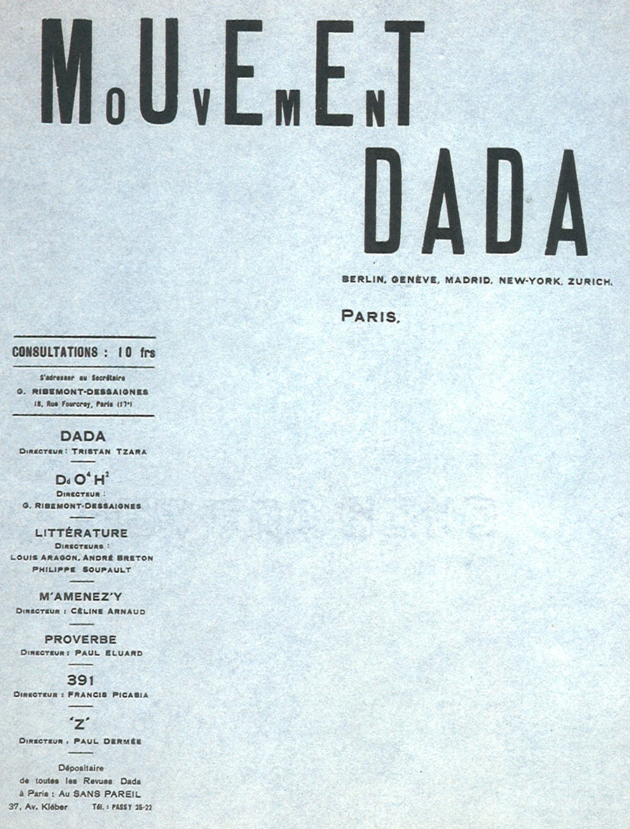
Tristan Tzara, MoUvEmEnT DADA. Paris c. 1918

Johannes Baader and Raoul Hausmann, Club Dada postcard. Berlin, c. 1919

Anonymous, Cause Le Surréalism (a Surrealist association). Paris, 1940s

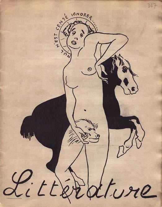
Benjamin Péret. Paris (Collection W Michael Sheehe, New York)
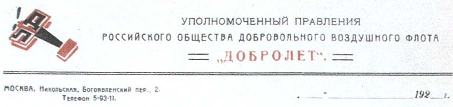
Alexander Rodchenko, Dobrolet State Merchant Air Service. Moscow, 1923
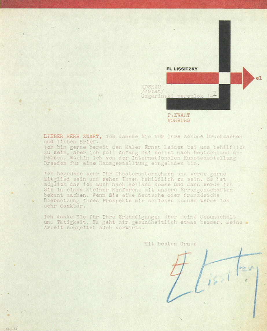
El Lissitzky. Moscow, 1924

El Lissitzky, Vesc/Object/Gegenstand. Berlin, 1922 (from the collection of Hans Berndt, Germany)

Theo Van Doesburg, De Stijl NB postcard. Netherlands (The Hague and Leiden), 1920

Piet Zwart, Wij Nu Experimenteel Tooneel. The Hague, 1925
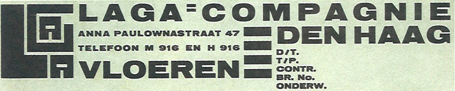
Piet Zwart, Laga-Compangnie. The Hague, 1922

Thon De Does, Reclame Ontwerper. Rotterdam, 1930

Josef Peeters, Het Overzicht postcard. Antwerp, 1923
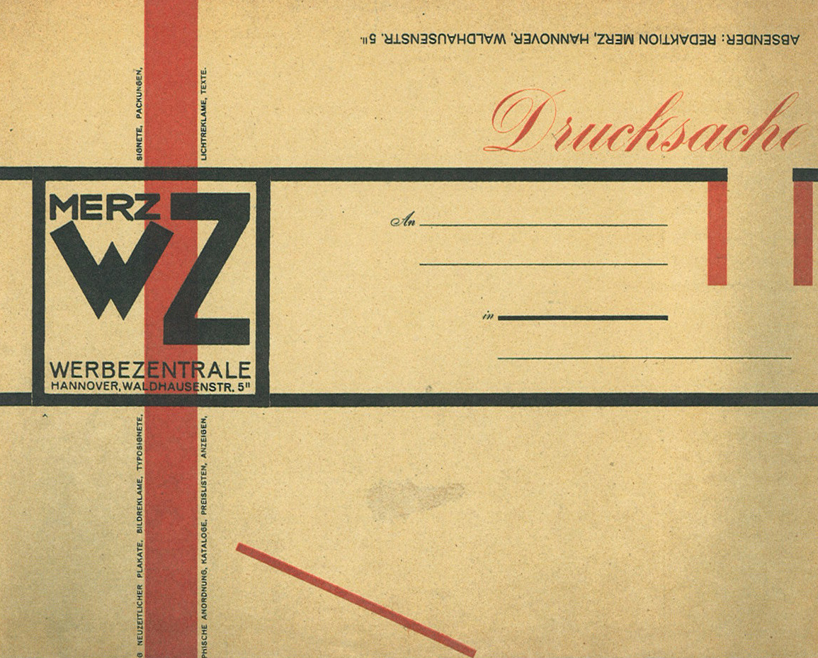
Kurt Schwitters, Merz Werbezentrale envelope. Hanover, 1924
Joost Schmidt, Das Bauhaus in Dessau postcard. Dessau, 1925-26
Herbert Bayer, Ernst Kraus Glasmaler Weimar. Weimar, 1924 (Collection W Michael Sheehe, New York)

E McKnight Kauffer, Lumium Limited. London, 1935 (Collection Cooper-Hewitt, Nat. Design Museum, Smithsonian Institution)
-
all images from Elaine Lustig Cohen and Ellen Lupton's book Letters from the Avant Garde: Modern Graphic Design [link]
also see the blog Billheads & Receipts [link]
David A Bontrager has a remarkable collection of trucking company letterhead [link]
letterhead at amassblog [link]
Insurance Letterhead and Covers [link]


7 comments:
These are fantastic. Going to have to remember to try and pick up this book.
Thanks!
Another great post.
I had wondered before about the swan/crab image featured on the Peret letterhead, which I last saw on the endpapers of a book by Aragon. [see this post]
An anonymous commenter suggested: "It is a crab on an anvil. The image is from Lautreamont."
Does the book happen to mention who created it? Such a cool logo.
Will
Hello. As a university student I was very fond of the Avant-garde movement. I even remember reading Marinetti. So thank you very much for your post. As I work a lot these days I almost forgot how nice it is to pick a book and relax.
Take care,
Sara
@S.Lemon thanks for your comment...glad you like them, definitely pickup a copy of the book, it is excellent and has so many more beautiful designs.
@Will thanks for the kind words Will! from the book: "The symbol is based on a passage from Lautreámont: "Turn towards swan lake; and, I will tell you later why, there is among the flock one completely black, bearing an anvil, topped by the purifying cadaver of a crab, that inspires with good reason the mistrust of the other aquatic comrades."
a slightly different translation is here:
http://books.google.com/books?id=PYwfvEUJqUUC&pg=PA271&lpg=PA271&dq=swan+lake+Lautre%C3%A1mont&source=bl&ots=7Y5Hwq2r1i&sig=Totb3uo63UDFVw-j5yZk4jfQr9A&hl=en&ei=zhvpStDbFae8tgOYy_zUCA&sa=X&oi=book_result&ct=result&resnum=1&ved=0CAgQ6AEwAA#v=onepage&q=&f=false
@Sara thanks so much for your comment. I'm really glad that you enjoyed the post and hope that it helped rekindle an old interest.
A fine presentation. I'm always pleased with a visit here.
Fantastic post! Thanks for sharing.
Great post. It's interesting to see the impact only an old fashioned letterhead can have; these just wouldn't have the same feel in an email...
Post a Comment