In order to promote these showings, artists were hired to paint large posters of the films (usually on used canvas flour sacks). The artists were given the artistic freedom to paint the posters as they desired - often adding elements that weren’t in the actual films, or without even having seen the movies. When the posters were finished they were rolled up and taken on the road (note the heavy damages). The “mobile cinema” began to decline in the mid-nineties due to greater availability of television and video; as a result the painted film posters were substituted for less interesting/artistic posters produced on photocopied paper.
The artistic freedom that these artists were given allowed for the creation of some very interesting and sometimes bizarre posters that, as screenwriter Walter Hill wrote, were quite often “more interesting than the films.”
Most of these posters come from the book Extreme Canvas: Movie Poster Paintings from Ghana that Will from A Journey Around My Skull linked me to. The rest were found online at the below links.

Cujo (Lewis Teague, 1983)
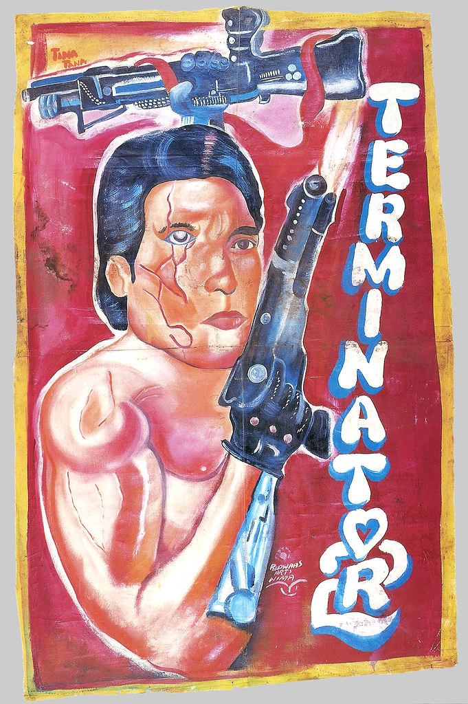
The Terminator 2 (James Cameron, 1991)
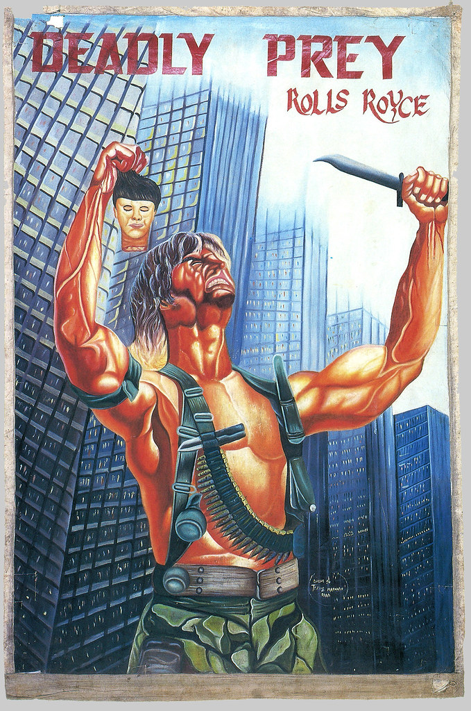
Deadly Prey (David A. Prior, 1987)
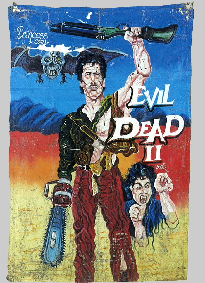
Evil Dead II (Sam Raimi, 1987)

Demonic Toys (Peter Manoogian, 1992)
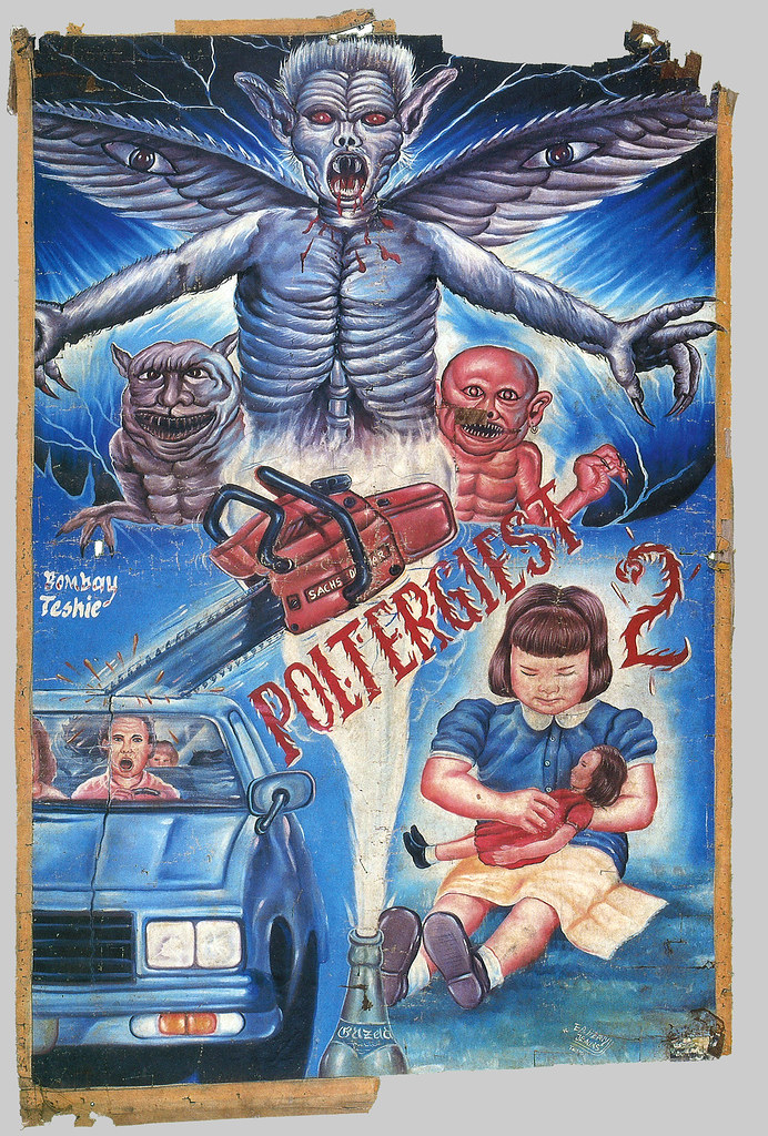
Poltergeist II: The Other Side (Brian Gibson, 1986)
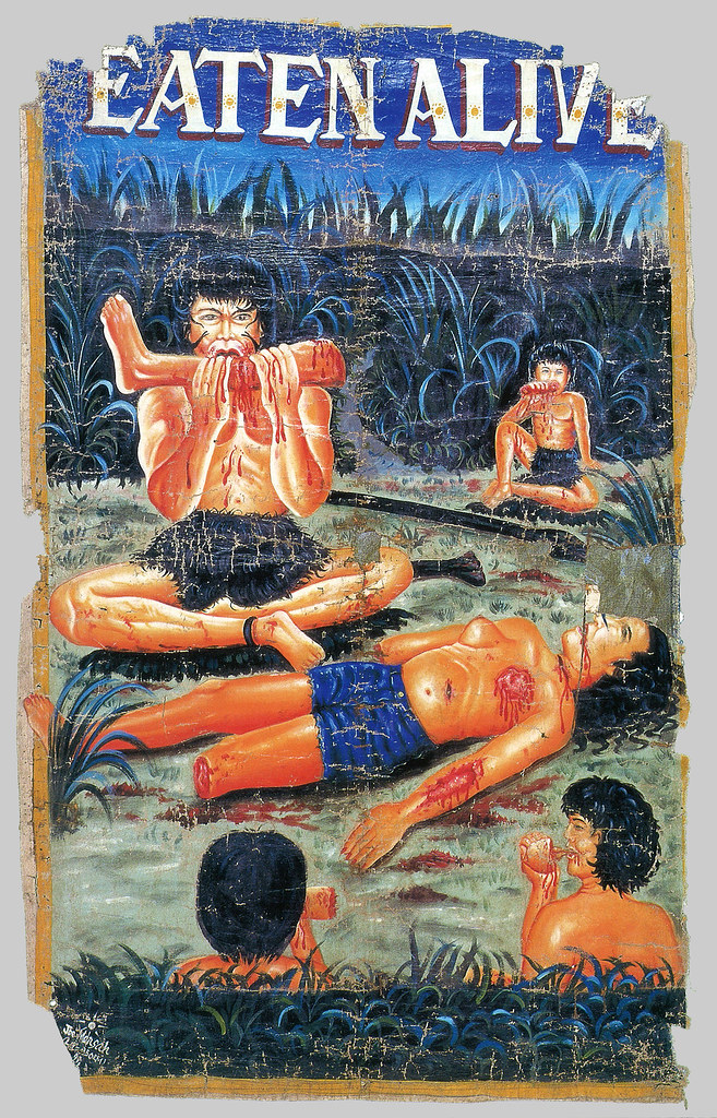
Eaten Alive (Tobe Hooper, 1977)
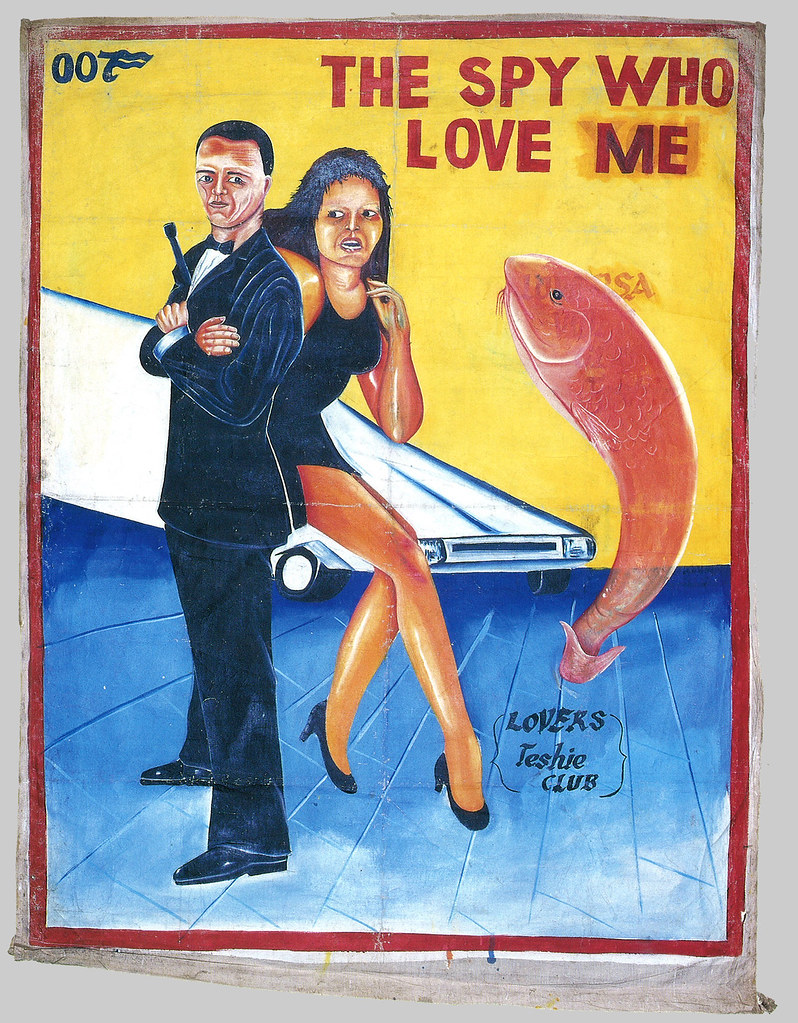
The Spy Who Loved Me (Lewis Gilbert, 1977)
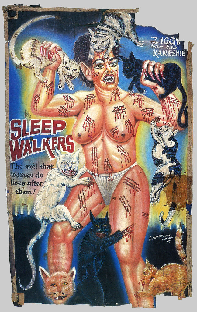
Sleepwalkers (Mick Garris, 1992)
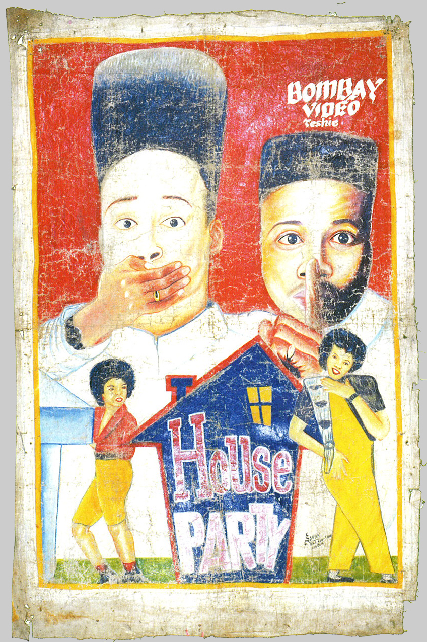
House Party (Reginald Hudlin, 1990)
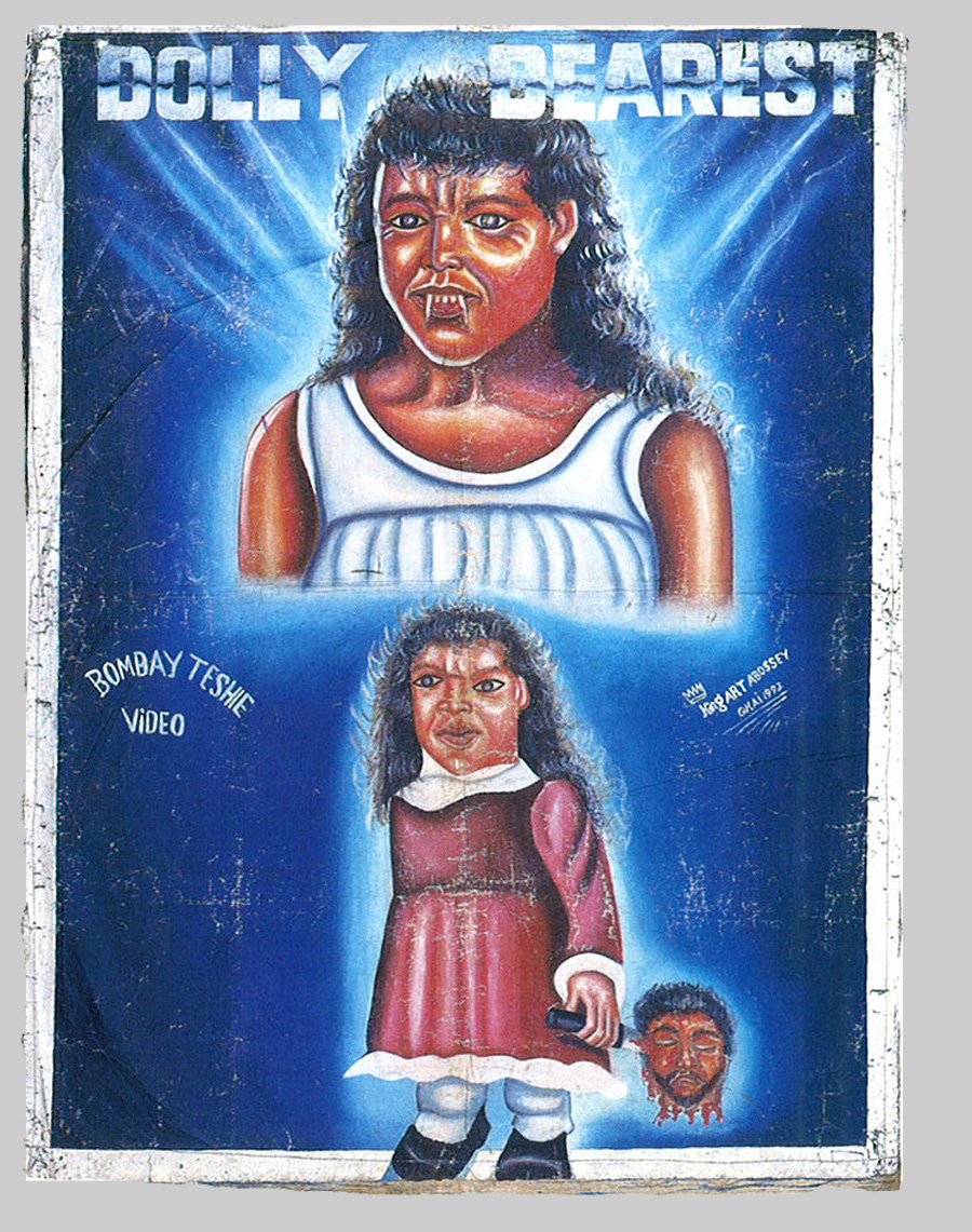
Dolly Dearest (Maria Lease, 1991)

Children of the Corn III: Urban Harvest (James D.R. Hickox, 1995)
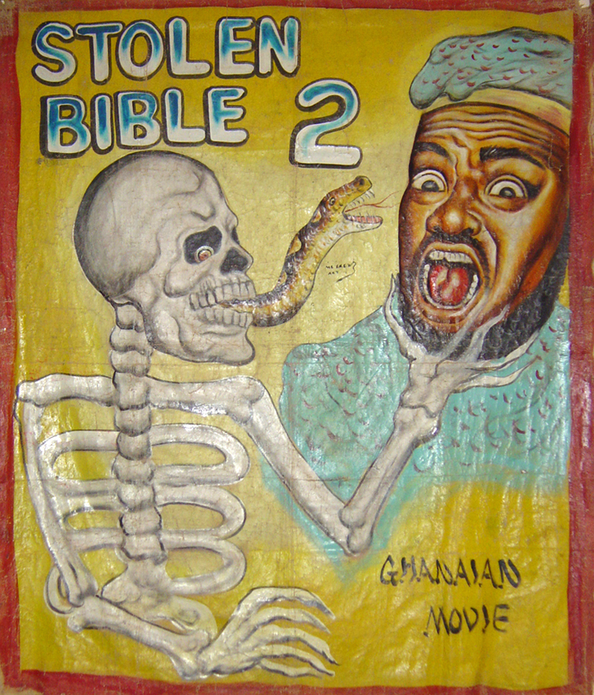
The Stolen Bible 2 (Emeka Nwabueze, 2004)
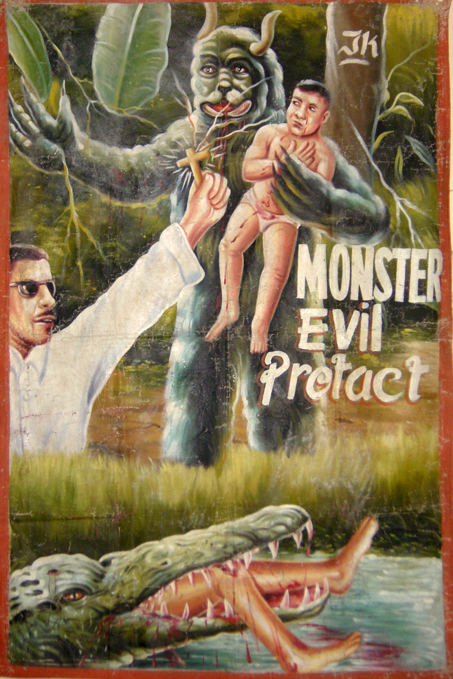
Monster Evil Protact [?]
-
Extreme Canvas: Movie Poster Paintings from Ghana by Ernie Wolfe, Ernie Wolfe III, John Yau, Roy Sieber - worldcat [link] amazon [link]
GhanaMoviePosters.com [link]
Killers of Canvas @ the Dutch Poster Museum [link]
online exhibition at Rene Wanner's Poster Page [link]







48 comments:
I love these and your blog.
Cujo as an Irish Setter. Nice touch.
Poor Cujo looks like Donald Sutherland. Very cool!
just his head is irish setter. maybe his body is still st. bernard. a very tan st. bernard...
#7 can't be Hooper's Eaten Alive. It's probably Umberto Lenzi's Mangiati Vivi.
These are fantastic. Just found your blog. Glad I did and appreciate the work you put into it.
what is funny on the "spy who loved me" poster that the word "me" is on the top of a removed "you"
This is an excellent post! I'm impressed that someone photographed and kept these - the epitome of kitsch.
I have to put up a link to this - from my blog. I think my readers will get a laugh out of these posters. Go Ghana!!! :)
Hi Joel - I linked you here: http://www.hollisramblings.blogspot.com - have a look! Thanks and keep up the great work.
Found a lot more of these kinds of things here-
www.AfricanRoadsigns.com
Funny stuff. Cujo never looked so scary.
The "Sleepwalkers" poster has just reminded me of why I truly am a cat person.
my god... House Party looks terrifying.
I must have there, or copies...they would be the perfect addition to my living room of horror.
How "deadly" can that "prey" be, with that tiny head?
...unless that's just ONE of its heads?
jesus if this is the shit they watch then no wonder things are so fucked up over there!
"jesus if this is the shit they watch then no wonder things are so fucked up over there!"
The only thing that's fucked up is your reading comprehension skills.
The very first sentence of the post states very clearly when these movies were being watched.
you gotta love the the heart in place of the O in TERMINATOR 2
The boob eating going on in Eaten Alive pretty much did it for me.
those posters are marvelous! they look like some covers from an alternate course of Argosy pulps from the Twenties...
they are visceral! thanks for sharing them!
I would love to buy actual prints of those!
beautiful! thanks for posting these!
"Eaten Alive" poster looks like for Umberto Lenzi's movie, not Hooper's. There were no cannibals in Tobe Hooper's "Eaten Alive". It's about evil croc:)
What a brilliant post.
Those are great.
To die for. Something in the style of those would make a nice Criterion cover for something.
The CUJO one honestly looks like a children's book written by a psychopath.
Hi J.L. - I agree - looks like a Psychopath movie!
I took some of these posters and put them alongside the original movie posters - I must say, the Ghanaian ones are so much more interesting!
Being in Ghana, I should really try and find some of these locally!
I found your blog by clicking through CinemaRetro's blog. I'm so glad I did!
A truly mind-tingling heck of a time. Scrolling down the page just got better and better.
I'd love to see these as t-shirts. They're awesome!
Nice blog I like it ! If you want the best free hosting details at http://hubpages.com/hub/hosting-ms-sql-web and much much more ...
this is morbidity at its finest! wow.
These should be the official promotional images for all these movies. They express so well their artistic intent and cultural value.
Interesting. Most of these seem to be from self-taught artists, but some seem to be from people with some formal artistic education. Take, for instance, the cubist-inspired Terminator poster or the House Party one (the technique and the visual design are fairly sophisticated for what was probably meant to be disposable art). The video guys probably hired some starving art students.
as a young child i use to see (and remember) some of the posters on seeing them lol.
i remember the first time i saw children of the corn, sleep walkers and poltergeist...it scares me :) child thoughts...
Well that was a nice post. I liked it.
Bathmate
Excellent picture.I am really impressed.I want to buy it...Thanks
Good times there.. Saw some of the same in Russia back in the 90s, in the bootleg video markets.
These look similar to the horror comic books I used to read. Very scary. My Blog : earn money chao!
Amazing. Enchanting. Advertising in this type of Posters makes people turn towards it.
I took some of these posters and put them alongside the original movie posters - I must say, the Ghanaian ones are so much more interesting!
anybody else get really familiar feelings from some of the images in the posters? I know some like Deadly Prey are copied directly from the original poster (which makes the tiny head even stranger) but the dog/something in Killer Toys gave me serious vibes of something else and I think it reminded me of the cow in Guernica... and when I looked up Guernica just now the random hand gripping a pistol in the Terminat<3r poster seems similar but I might be pushing it there. Also a lot of things reminded me of Japanese/Chinese art, the completely random fish in Spy Who Love Me and I forget if it was Children of the Corn or one of the other ones has an old lady that I think is either channeling the Wizard of Oz or some kind of Yama-uba creature. And the one monster biting down on an arm reminded me of a Tengu. And the lady/monster with bugs in her hair reminds me of a demonic shampoo ad lol. Not seriously but it does seem like it was traced (modified to say the least)from some photograph. I'm really curious about the ratio of original/reappropriated images from paintings/posters/advertising. It doesn't help that I have no idea what somebody from Ghana would be exposed to during that time period - I'm surprised half those movies were successful enough that they were being shown in the first place (what the hell is Killer Toys anyway?)
The Cujo poster creeps me out about 100 times worse than any of the others. Anybody else think his eyes look way too human/intelligent? And the shape reminds me of a man sitting or standing, like the torso doesn't correspond to the rest of the figure. (I mean aside from the bottom belonging to a rottweiler) It almost reminds me of that Francis Bacon painting where it suggests 4 or 5 different figures and then disguised as a cute basset hound on top of everything else. The one detailed eye when the other is just this blot creeps me out too, I don't know if it's an all-seeing eye feel or what. My last theory was it it doesn't even look like a living breathing dog, it looks like a man /wearing/ a dog or some kind of freaky Ed Gein thing like that. Again the uh lady reminds me of some mutant geisha. A lot of the posters in general have this feel like limbs don't correspond to bodies in a way that should seem unskilled but feels too purposeful at the same time. I don't think it would be half as scary if it were fully realistic or cartoonish. My mind keeps switching between thinking it's just a bad painting and everything was done the exact way they intended. Some of the posters come off as way more morbid than the others so maybe it's just one artist where I'm seeing that. (The Evil Dead poster for example doesn't really scare me at all, that creature in the corner is really strange but for some reason bizarre != scary in that case)
sorry if I got some of the images/posters they're from wrong I'm too squeamish and immediately scrolled to the bottom of the page
has anybody ever tracked down the artists who did these? and how many unique artists are there between the posters shown? I'm really curious what the heck they're like, if this is their sellout commercial art what in the world would their original art look like
sorry if this read like a book report but these paintings are just such an enigma, I can't even start to figure them out or if there's even anything to figure out in the first place. There's another website with more Ghanese posters like these, some were more on the pulpy side of things but one was for The Rise and Fall of Idi Amin where he's painted in a style like these. So then for a while I thought oh god what if everything in these posters has some embedded/double meaning kind of like these http://wellmedicated.com/inspiration/50-incredible-film-posters-from-poland/
um in closing I like all the ad-bots "very impressive keep up the good work"
looking great
there's a book with some of these and others too in it. it's called ghanavision.
I have some reason to believe this guy might be the artist who did the Children of the Corn III poster
http://www.grographics.com/wordpress/2006/06/27/akirash/
either way that American Cyborg poster looks pretty great
Magnificent.
These are some awesome ones. I have a collection myself of these African movie posters. I am selling some of them as well. Check them out here: http://www.etsy.com/shop/Secousse
Nice paintings..excellent art..web designing company
I found myself smiling after looking at the posters. The movies are scary but the posters appeared to be funny.
xo,
Grace|employment posters
Post a Comment